Diversifying arts meaning
In this blog I will be looking at three different artists and how they changed the conception of what art is during the mid modern movement. I will be using the elements of art to define the impacts of each piece of art to highlight the changing ways in which we interact with art through these different art movements.


Pace Gallery. “Pace Gallery | Chuck Close.” Www.pacegallery.com, www.pacegallery.com/artists/chuck-close/.
Tate. “Hyper-Realism – Art Term | Tate.” Tate, 2017, www.tate.org.uk/art/art-terms/h/hyper-realism.
“The Andy Warhol Museum.” The Andy Warhol Museum, 2017, www.warhol.org/.

Andy Warhol's "Campbell's soup cans" are such a well known portrayal of pop art style. It's so fun because we get to see something so normal and overlooked- like a soup can- turned into art! It's cool, brightly colored, and even a bit nostalgic for some viewers. I think the subject matter is one of the main reasons this art became so famous and well known. Everybody knows campbell's soup, whether they have had it, seen it in the grocery store, or on a commerical. It is an accessible kitchen cabinet commodity turned into something people want to hang on their wall.
ReplyDeleteI find your theme for this week's blog captivating. I was compelled to create a blog that included Andy Warhol's art myself. Soup cans played a persistent role in Andy Warhol's art. In fact, on July 9th, 1962, he opened a show at Ferus Gallery in Los Angeles with 32 paintings of Campbell's soup cans. His art contradicted traditional art and demonstrated how capitalism and consumerism infiltrated American life and culture. These legendary soup cans were the first wave of the upcoming pop art revolution.
ReplyDeleteChuck Close and his paintings Phil and Bob 1969 reminded me of mugshots at first, with the depicted faces placed against a neutral background. I never embraced hyperrealism art, considering it rather a skill, but after prolonged viewing, I noticed the similarity to surrealism, making the artworks more appealing.
All of the showcased paintings addressed the selected theme well. Pop art, hyperrealism, and op art certainly redefined the meaning of art.
Chuck Close's choice of portraits in hyperrealism style can also be seen as part of his ongoing battle with prosopagnosia, a disability to recognize or differentiate between human faces.
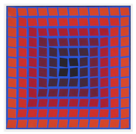
Hi Fin! These are all such interesting paintings. I completely agree with your analysis of Op art. Its beauty is in what it does to our brains rather than the actual content of the art. Optical illusions like these are much more common now, but it would have been so cool to see art like this when it was first created. I absolutely thought the two portraits were actual photographs at first. It is impressive how accurate these paintings are. I think that the choice to paint only in black and white helps avoid the distraction that color would cause and allows the viewer to focus on the essential components of these paintings. I appreciate that you included some of Andy Warhol's soup cans. In second grade, I took an art class and one of the projects was replicating Warhol's soup can art. I remember how long it took to copy all of the details onto each paper. When I finally finished drawing, I was free to color them in however I wanted. That experience allowed me to notice the contrasts contained within the soup cans. They look so accurate, detailed, and restrained in shape and content, but the colors allow the paintings a whimsical and wild feeling as well.
ReplyDeleteI like the styles you chose Fin! I especially agree with you when it comes to Op art- optical illusions are fascinating, so it's really cool to see them being considered as a form of art. Something about the pieces you chose as well gave me an early computer kind of vibe, which I think felt almost a little nostalgic- kind of like something you'd see from the original Tron movie? Anyways, I also loved the portraits you featured! It's incredibly impressive that someone was able to make those, but something about the scale on which it was painted lends even more credence to the talent of Chuck Close. Personally, I never appreciated Andy Worhol's works in spite of his popularity, so I'm glad that you brought to light the other two artists that you chose to cover. You can always argue over what should be considered art, but seeing paintings like what Close and Vasarel created is certainly makes the conversation much less subjective, in my opinion.
ReplyDelete