Preferences and perspectives - Romantic Era
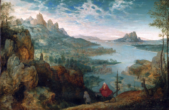
I will compare the differences between the Hudson River School artists and artists of the Pre-raphealite. By examining their landscape paintings I will point out my aesthetic preferences between the two while still acknowledging their inspirations. The first paintings are both from Hudson River School artists.


The top painting is Into Yosemite Valley by William Keith, it was painted in 1895 on one of his many trips to Yosemite. The painting is a fantastic example of how the Hudson River School students would pick grand scenes and make them appear even grander. The small people in the image making their way up the hill add a sense of scale to the mountains in the background. This depth from the atmospheric perspective and composition allows the viewer to spend more time in the painting, almost relaxing in the awe of the landscape. The second painting by Thomas Moran titled 'Dusk Wings' was painted in 1860. This painting depicts the grandeur of a sunset as it casts its light above the peaceful land. This is yet another example of the Hudson River School style of depicting grand scenes. The painting activates the foreground with sparkling details picked up by the setting sun and ensures a feeling of life by using birds in the sky. Together these elements make the painting visually stunning, allowing a viewer to sense the power and awe of the sun. The Romantic period's influence is also evident in these paintings as they explore nothing but the extraordinary, making grand scenes grander through their techniques.
I am responding very well to the serenity of the scenes created by their depth and cohesive color pallets. It also helps that the composition places me as a viewer into the landscape creating a more intimate interaction with the scene. This is in line with the school's goals of choosing nature over man-made things, as well as inspiring admiration for the beauty of the American landscape. I would certainly own copies of either of these paintings, they would be an amazing way to bring inspiration into my art collection.


These two paintings are both pre-Raphaelite landscapes that I also really enjoy. The top painting is titled 'Ophelia' and was painted 1851-1852 by Sir John Everett Millais. Following the Pre-Raphaelite brotherhood John painted with close observation of nature, painting the background scene from life. It wasn't until later that he decided to add Ophelia into the painting, for which he had a woman pose in a bathtub full of water over 4 months to finish the painting. Both using a real model and painting from nature were ways in which he could stay faithful to the rich details common among the brotherhood. I find this painting evocative and unique, it is obviously painted with extreme care and the detailed effect helps keep me looking at the painting. It does feel a bit cramped within the composition, probably a part of the goal of the piece, but it makes me as a viewer have a hard time maintaining in the piece. The next piece is titled 'Our English' Coasts, also known as 'Strayed Sheep', and is a painting by William Holman Hunt, completed in 1852. This painting has a very rich and high-contrast color scheme characteristic of pre-Raphaelite paintings and was also mainly painted from life. William even painted the butterflies from a live butterfly in one sitting as the final piece of detail. Because of the rich colors and abundance of life, this painting seems very imaginative despite being painted from life.
Of these two paintings I respond really well to the rendering of details in bright color, this deviates from the Hudson River paintings which had details rendered in a much more muted and earthy scheme. Because of this difference, I find the Pre-Raphaelite paintings whimsical and surreal, this is a fantastic effect but doesn't appeal to my aesthetic preferences as much as the Hudson School. The Hudson School paintings are not necessarily realistic scenes but are conveyed convincingly to imagine that they actually exist. Although the Pre-Raphaelite painters had a goal similar to the Hudson River painters, to capture nature in exquisite detail, they employed higher contrast paint techniques that aren't representative to me of real-life scenarios. Because of this I much prefer the Hudson school painters, But I would certainly own a copy of both of these paintings as well, because a certain amount of whimsy can be very freeing.
Tate. ““Our English Coasts, 1852 (“Strayed Sheep”)”, William Holman Hunt, 1852 | Tate.” Tate, 2016, www.tate.org.uk/art/artworks/hunt-our-english-coasts-1852-strayed-sheep-n05665.
Tate. ““Ophelia”, Sir John Everett Millais, Bt, 1851-2.” Tate, 2018, www.tate.org.uk/art/artworks/millais-ophelia-n01506.
I am in awe of the painting by Thomas Moran titled 'Dusk Wings'. The sunset looks so vivid, and the hues of the blue sky up top are the perfect color for an actual sunset. The clouds look surreal! The landscape lighting is just as it would look at dusk. I am blown away at how real this painting looks. It is by far the best landscape painting I have seen. I see that he began his artistic career as a young teenager! I prefer the Hudson River School paintings over the pre-racial ones because I love landscape photography, and the paintings look so surreal.
ReplyDeleteHi Fin, I also featured Hudson River School in my post but I did not get to do much research on Pre-Raphaelites, so I appreciated your comparison of these different style landscape paintings. I agree with you that the Hudson River School paintings are more appealing. I think you explained perfectly that the Pre-Raphaelites paintings have a more whimsical feel due to their use of high contrast, bright colors. Overall, I really like that the Romantic Era painters valued landscapes. As you noted, one of the Hudson River School’s goals was to inspire admiration for the beauty of the American landscape; I believe this was important to them because the idea of Manifest Destiny was prevalent during this time.
DeleteI hadn’t personally found many Pre-Raphaelite paintings that I was very fond of. But somehow, both you’ve chose to showcase are gorgeous! I absolutely agree with you that they feel whimsical, especially in comparison to the Hudson River School pieces that you have included in your blog. I think what draws me to the Pre-Raphaelite pieces is the warmth in color palette. I am especially drawn to the sheep grazing painting, which I hadn’t realized at first, was painted by William Holman Hunt. I included in my blog a painting called “Scapegoat”, which was painted by him as well. I clearly have a preference for both the painter and the subject matter of sheep and goat. Weird. One thing I noticed in 'Strayed Sheep' was that it looks like the face of a wolf was painted into the lowest rock right in the center of the painting. I do know Hunt was a very religious man, so the subject matter of sheep does not surprise me, as they are a sacred animal in the Bible. I do wonder if there is a religious aspect behind the sheep and possible-wolf portrayed within the painting.
ReplyDeletethe artwork you chose is breathtaking. The amount of detail that is put into all 4 of these paintings is just incredible. my favorite is the Hudson River School paintings. I love the way the attention to detail is so obvious. the paintings look so real, you could probably trick me into thinking they were taken with a camera. i like the way you pointed out the differences between the two styles, and i agree with you. Though the Pre-Raphaelite style had similar goals with their paintings as the Hudson River style, the Hudson River style just seemed to be able to do it better.
ReplyDeleteFor this blog, I prefer the pictures chosen from the Romantic Era that feature the Hudson River School artists. I was born and raised in central California and had the privilege of visiting Yosemite National Park many times while growing up in the 60s. I remember my father would pull our car into a lookout and then we would all walk a bit to sit on an outcropping of a rock to take in the beauty of the majestic landscape. My mother would hand out the sandwiches she packed for our lunch and then we would eat, mostly in silence while enjoying the view. The fact that conversation was not needed was mutually understood. I feel confident that the artist experienced the same awe and excitement and knew he had to capture the majestic beauty surrounding him.
ReplyDeleteThe second picture titled “Dusk Wings” shows a landscape that I would often find in my hometown with the sunset in the distance, which I miss dearly. I could go back there to visit, but the landscape is nothing like it was 40 years ago. Thank you for the trip down memory lane.
I am not fond of the two pre-Raphaelite paintings. While the painting titled “Ophelia” has a beautiful, lush background, but the expression he painted woman’s face makes me think of finding someone who has drowned. She has a blank look in her eyes and her mouth is slightly open as if she were trying to say something at the very moment she died. I am struggling to guess what his reasoning was for her not showing more emotion or at least to be looking at something instead of a blank stare at nothing. Was that was his intent?
The next one titled “Our English” I do not necessarily dislike but am not fond of. I would not have it in my house. I grew up in a farming town surrounded by crops and pastures full of cattle and sheep. I remember the smells well, and they all come rushing back while looking at this picture. Thus, the artist was painting real life as it would look on a sheep farm. Thank goodness the painting has no smell!
I have a strong preference for the Hudson River School art, the coloration on the Pre-Raphaelite art looks icky and wrong to me.
ReplyDelete